
Check How Many People Are Older Than You on Earth
How Many People Are Older Than You?
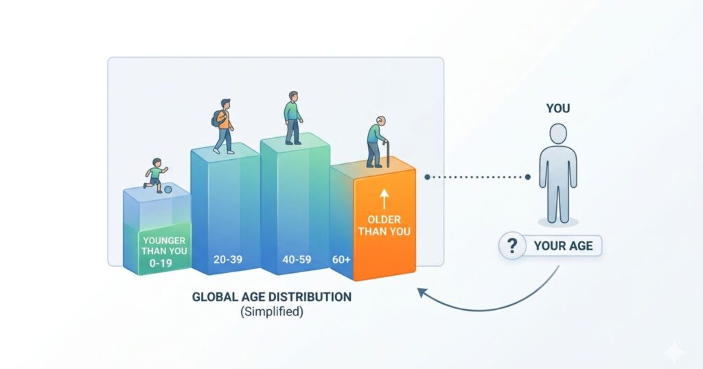
Find out exactly where you sit in the global age pyramid — how many living people are older, younger, and the same generation as you.
Figures are statistical approximations. Global median age ≈ 30.5 years (2026 est.).
How Many People Are Older Than You? Global Age Data 2026
Over 8.3 billion people shared the planet in 2026. That total continues to climb, though at a slower pace than in previous decades, as fertility rates moderate across most regions. Every individual occupies a distinct position within this vast group, and the question of how many people are older than you offers a concrete measure of that placement. Age distribution data drawn from rigorous national censuses and international modeling show clear patterns that have evolved steadily since the mid-twentieth century.
The stakes extend beyond curiosity. Policymakers rely on these figures to plan for education systems, health services, and retirement programs, while businesses track workforce availability. Individuals gain context on their place in humanity when they see how their birth year aligns with broader trends in survival rates and family sizes. Precise calculations depend on integrating single-year age data from sources like the United Nations World Population Prospects, which update estimates annually to reflect new births, deaths, and migration flows.
Such information grounds abstract numbers in personal terms. A person turning thirty today sits near the global median age, which stands at 31.1 years. This positioning means roughly half the population falls below that threshold and half above it, though exact counts vary by gender and precise date of birth. The underlying data reflect decades of demographic transition marked by improved child survival, declining birth rates, and extended life expectancies in many countries.
Calculating How Many People Are Older Than You
Age distribution statistics provide the foundation for determining how many people are older than you. Demographers sort the entire global population from youngest to oldest, then locate any given age within that ordered list. The result yields a percentile rank that translates directly into a head count of those who have lived longer. Tools built on United Nations data perform these integrations by combining detailed single-year population figures with adjustments for undercounting in certain regions.
The process begins with total population estimates, which reached approximately 8,300,678,395 in 2026. From there, analysts apply age-specific breakdowns to compute cumulative totals. For instance, anyone older than the median age exceeds roughly 4.15 billion others. These figures update frequently to account for daily births and deaths, so the exact number shifts each day slightly. Regional variations add nuance because some continents maintain younger profiles while others skew older due to differing fertility and mortality patterns.
Comparisons across time illustrate the dynamic nature of these rankings. In 1950, the median age hovered near twenty years, meaning most adults ranked among the older half of humanity. Today, the shift toward thirty-one years reflects successful public health advances and economic development that have altered family planning decisions worldwide. Such historical context clarifies why a thirty-year-old in 2026 occupies a different relative position than a thirty-year-old in earlier eras.
Global Population Pyramids Reveal Age Structures
Population pyramids visualize the age and sex breakdown of the world at a glance. These charts display males on one side and females on the other, with bars representing each five-year or single-year cohort. The shape indicates growth momentum: a broad base signals high birth rates and future expansion, while a narrower top reflects longer survival into advanced ages. Current global pyramids show a transitional form that has moved away from the expansive profile of the twentieth century.
Key insights emerge from pyramid analysis. The cohort aged zero to fourteen accounts for about twenty-four percent of the total population, or roughly two billion people. The working age group from fifteen to sixty-four makes up sixty-five percent or approximately five point four billion. Those sixty-five and older represent around eleven percent or nearly nine hundred million individuals. These proportions have shifted gradually as fertility rates fell from higher levels in past decades.
The pyramid also highlights gender differences. Women tend to outnumber men in older age groups due to longer average lifespans. This imbalance grows more pronounced after age seventy and influences the final counts for how many people are older than you when gender specific data enter the equation. Pyramids, therefore, serve as essential diagnostic tools for demographers tracking structural change.
Key Age Group Comparisons Worldwide
The following table organizes major age categories with their shares and approximate counts based on 2026 projections. It illustrates the concentration of population in working ages while underscoring the smaller but growing share of older adults.
| Age Group | Share of World Population (%) | Approximate Population (billions) |
|---|---|---|
| 0 to 14 | 24 | 2.0 |
| 15 to 64 | 65 | 5.4 |
| 65 and older | 11 | 0.9 |
These aggregates mask finer details available in single-year data, but they offer a reliable starting point for understanding broad placement. For example, most people aged forty or above already surpass a majority of the global population. The table draws from harmonized international estimates that reconcile national reporting differences.
Regional Differences Shape Age Rankings
Age structures vary sharply by continent and income level. Africa maintains the youngest profile with a larger share under fifteen and a median age well below the global average. Asia, which houses the majority of humanity, shows more balanced pyramids after decades of rapid fertility decline. Europe and North America exhibit constrictive shapes with higher median ages and larger elderly cohorts. These differences mean that a person of the same age can rank quite differently depending on the reference population.
Latin America and the Caribbean sit in an intermediate position as fertility transitions mature. Oceania displays diversity across its island nations and developed economies. Migration further complicates regional pictures because younger workers often move toward opportunity while retirees stay in place. When global calculations combine all regions, the weighted average produces the worldwide rank, yet local comparisons remain valuable for context.
Such variation underscores the importance of using consistent data sources. International organizations standardize methodologies to enable fair cross-country analysis while still preserving country-level detail for specialized studies.
Demographic Trends Driving Future Shifts
Fertility rates now average 2.2 births per woman globally, down from higher levels in earlier generations. This decline slows overall population growth and gradually lifts the median age. Life expectancy has risen to 73.8 years worldwide, with women averaging 76.4 years and men 71.2 years. These gains extend the upper tail of the age distribution and increase the absolute number of people reaching advanced ages.
Projections indicate continued but moderating growth. The world population is expected to approach 9.7 billion by 2050 under medium scenarios. At the same time, the share of people aged sixty-five and older will expand significantly as the large cohorts born in the late twentieth century move into retirement age. These shifts will alter age ranks for everyone alive today because younger entrants will represent a smaller proportion of the total.
Urbanization adds another layer. Over fifty-eight percent of people now live in cities where family sizes tend to be smaller and access to education and health care supports longer lives. The interplay of these forces creates a future in which age percentiles evolve steadily rather than remaining fixed.
Historical Context of Population Growth and Age
Human numbers grew slowly for most of history, then accelerated dramatically after 1950. The population doubled from roughly 2.5 billion in 1950 to five billion by 1987 and reached eight billion in 2022. Each surge changed age structures by injecting large youth cohorts that later aged in place. The current slowdown reflects widespread adoption of smaller family norms made possible by economic progress and voluntary choices.
Past data show how dramatically the ranks have moved. Someone born in 1950 reached adulthood when the median age was about twenty. Today, the same person would rank among the older segment of the population. These comparisons highlight the value of viewing personal age through a long-term demographic lens rather than isolated snapshots.
Implications of Age Rank for Society
Age ranks inform discussions on labor supply, pension sustainability, and educational demand without prescribing specific policies. Societies with younger populations often focus resources on schools and job creation, while those with older profiles emphasize health care and retirement systems. Global averages mask these local priorities, yet they provide a common reference point.
The data also foster appreciation for generational interdependence. Younger people depend on the knowledge and experience of those ahead of them, while older cohorts rely on the productivity and innovation of those who follow. This mutual reliance becomes visible when age distribution statistics translate into concrete numbers of people at each life stage.
Closing
Global age distribution data transform an abstract question into a tangible insight about humanity as a whole. The current median age of 31.1 years, combined with a total population exceeding 8.3 billion, places every individual in a precise spot that reflects decades of health advances, economic change, and family decisions. These patterns will keep evolving as fertility moderates further and life spans extend, producing new balances between youth working-age adults and seniors.
Awareness of such dynamics encourages thoughtful consideration of shared challenges and opportunities that span borders and generations. The numbers ultimately remind observers that population structures connect everyone in an ongoing story of growth, adaptation, and renewal.
FAQ
How do online tools figure out how many people are older than me?
Online platforms integrate single-year age data from United Nations estimates to sort the global population and locate your exact age within it. They account for daily births and deaths through continuous updates, so the result reflects the most recent figures. Accuracy depends on the underlying demographic models, which reconcile national census reports with statistical adjustments for coverage gaps.
What does the world median age tell me about my own rank?
The median age of 31.1 years in 2026 means that half the global population is younger and half is older than that threshold. Anyone above this age exceeds roughly 4.15 billion people, while those below fall into the younger segment. This benchmark provides a quick reference point before finer calculations adjust for your precise birthday and gender.
Why does the number of people older than me change every year?
New births add younger individuals, while deaths remove people from all age groups, with a greater impact at older ages. Migration redistributes populations across countries, but the global total evolves steadily. Annual updates to demographic databases capture these flows and keep age ranks current rather than static.
How accurate are global age rank calculations?
Calculations achieve high reliability when based on harmonized United Nations data that blend census results with modeling for under-reported areas. Minor discrepancies arise from timing differences in data collection, yet the overall percentile remains robust for comparative purposes. Continuous revisions by international statisticians improve precision over time.
Does gender make a difference in age rankings?
Women generally outlive men, so female cohorts dominate older age groups, and male ranks tend to place slightly higher among survivors at advanced ages. Global models incorporate sex specific mortality tables to reflect these patterns. The net effect appears most clearly after age sixty when survival gaps widen.
How has global age distribution changed since the 1950s?
The median age has risen from around twenty years in 1950 to 31.1 years today as fertility declined and child survival improved. Pyramids shifted from broad base, expansive forms to more balanced transitional shapes. These changes mean adults today occupy relatively younger positions within the total population than their counterparts did decades ago.
What might my age rank look like in 2050?
Projections show continued aging, with the median age climbing further and the share of people aged sixty-five and older expanding. Current thirty-year-olds could rank among an even larger older segment by mid-century if trends hold. Exact future numbers depend on fertility and mortality trajectories that international models update regularly.
Are age ranks different when compared by country instead of worldwide?
National rankings diverge sharply because some countries maintain median ages in the low twenties, while others exceed forty. A thirty-year-old may fall in the younger half globally yet rank older within a high fertility nation or younger within a low fertility one. Country-level data, therefore, complements the global view.
How do birth rates affect where I stand in the population?
Lower birth rates reduce the size of new youth cohorts and gradually raise the median age over time. Higher rates do the opposite by swelling younger groups. Global fertility at 2.2 births per woman has moderated this effect, yet regional differences still produce varied impacts on individual age percentiles.
Can age distribution data help track broader population trends?
Age breakdowns signal shifts in dependency ratios, workforce size, and future demand for services. Tracking changes over time reveals the pace of demographic transition and informs long-range planning. The data serve as a neutral mirror of collective choices in health education and family formation across the world.